
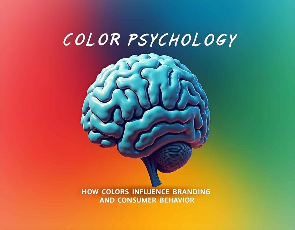
The Psychology of Color in Branding — Why Great Brands Choose the Right Colors
Color is not just a decoration. In branding, color is a way of communication between a brand and its customers.
Before a customer reads a slogan, understands a product, or remembers a name, they feel something—and color is often the first trigger. This is why successful brands treat color as a strategic decision, not a visual preference. The right color builds trust, appetite, excitement, loyalty, or calm. The wrong color creates confusion, disconnection, or indifference.
Understanding color psychology is essential for any brand that wants to stand out, connect emotionally, and remain memorable in a competitive market.
Why Color Psychology Matters in Branding
Human brains process color faster than text or shapes. Colors influence emotions, decisions, and even buying behavior. Strong brands use this psychological response intentionally. Their color choices are consistent, meaningful, and deeply aligned with their brand personality.
Let’s explore how three globally successful brands use color psychology effectively—each from a different industry.
McDonald’s — Appetite, Energy, and Familiarity
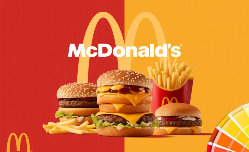
McDonald’s is one of the most recognizable brands in the world, largely due to its iconic red and yellow color combination.
- Red stimulates appetite, urgency, and excitement. It encourages quick decisions—perfect for fast food.
- Yellow represents happiness, warmth, and friendliness. It feels welcoming and family-oriented. Also, this color triggers people’s hunger feelings and motivates them to buy something to eat.
Together, these colors create an energetic and comforting brand experience. Whether you’re a child, a traveler, or someone in a hurry, McDonald’s colors instantly signal familiarity and quick satisfaction. This is not accidental—it’s decades of refined branding psychology at work.
Apple — Simplicity, Trust, and Innovation (Tech Brand)

Apple takes a completely different approach. Instead of loud or emotional colors, Apple relies on minimal tones—white, black, silver, and soft gray.
These colors communicate:
- Simplicity
- Sophistication
- Premium quality
- Technological confidence
Apple’s restrained color palette allows the product itself to shine while reinforcing a sense of trust and elegance. The brand feels calm, controlled, and innovative. This approach aligns perfectly with Apple’s philosophy: technology should be powerful but effortless.
The success of Apple proves that strong branding doesn’t always require bold colors—it requires the right emotional alignment.
Slack — Creativity, Collaboration, and Human Connection (SaaS Brand)
Slack, a leading SaaS collaboration platform, uses a vibrant yet balanced mix of purple, blue, green, and pink.
Each color plays a role:
- Purple suggests creativity and innovation
- Blue builds trust and reliability
- Green represents progress and productivity
- Pink adds warmth and approachability
Slack’s color system reflects how the platform feels to use—friendly, dynamic, collaborative, and human. In a SaaS world often dominated by cold corporate design, Slack stands out by feeling approachable and modern without losing professionalism.
This shows how thoughtful color usage can shape user experience and emotional connection in digital products.
The Common Thread Between Successful Brands
Despite operating in completely different industries, these brands share one principle:
Their color choices align perfectly with their brand message and audience psychology.
Color is not chosen based on trends or personal taste. It’s chosen based on:
- Audience behavior
- Emotional response
- Brand values
- Long-term consistency
This is what separates strong brands from forgettable ones.
Why Professional Branding Matters
Many businesses underestimate the impact of color. A poor color choice can weaken brand perception, confuse customers, or reduce trust—no matter how good the product is. On the other hand, the right color strategy strengthens brand recognition, emotional connection, and long-term growth.
This is where professional branding expertise becomes essential.
Why Brands Trust DesignoFly
At DesignoFly, branding is not about visuals alone—it’s about strategy, psychology, and purpose. We design brand identities that communicate clearly, connect emotionally, and perform consistently across platforms.
From choosing the right colors to crafting a cohesive visual system, we help brands build identities that are not only beautiful—but effective.
If you’re building a new brand or refining an existing one, DesignoFly is equipped to turn your vision into a powerful, psychology-driven brand presence.
🔗 Stay Connected
📘 Facebook Page: https://www.facebook.com/DesignoFlyStudio
👥 Facebook Group: https://www.facebook.com/groups/DesignoFlyStudio
📺 YouTube: https://www.youtube.com/@DesignoFlyStudio
Feel free to visit our other blog updates
#ColorPsychology #BrandingDesign #GraphicDesign #BrandIdentity #DesignoFly #VisualBranding #BrandStrategy